
Same negative, different chemistry
Five prints from one negative, each one exposed and treated for the picture it was meant to become
Laying these five prints side by side, I don’t hesitate, it’s clearly the same photograph. The pose, that direct look, the soft, pale wings sitting at the shoulders, it all starts from the same place. But my focus doesn’t land in the same way every time. Each print pulls me to a different spot.
They all came off the very same physical negative. What shifted at the printing stage was time. Cyanotype asked for more of it than kallitype or Van Dyke, and even among the cyanotypes I changed the exposure depending on what I knew I would do later.
Because “later” isn’t an afterthought here, it’s baked in from the start. If a print was headed for bleaching and toning, it needed extra density upfront so it could take the hit and still leave me something to shape. I was printing for an outcome I wouldn’t actually see until further down the line.
Allowing for what comes next
Printing an image that’s going to change again before it’s finished asks for a specific kind of judgement. You’re staring at one stage, but your mind has to stay with the next one.
With these cyanotypes, that meant giving certain sheets a deliberate push in exposure. Bleaching would strip away part of the image. So I needed that added depth waiting in the print, enough to survive the loss while still keeping what would eventually give the portrait its weight.
Start too thin, and you end too thin. The exposure had to carry the entire run, printing, bleaching, toning, and then the final balance between her figure and the space she sits inside.
What I was aiming for was the feeling of the finished print. Exposure time was one of the tools that got me there.
Three ways through cyanotype
The first three prints are all cyanotypes. That matters, because even before I bring another process into the mix, the differences are already big.
In the first version, I bleached with soda and then toned with tannin. In the photograph of that print, the warmer areas settle up against cooler, darker passages. The face pushes forward, and the wings feel suspended, not quite background, not quite fully with the figure either.
The second went into coffee. A lot of blue still stays in the image. A label like “coffee toned” tells you what was in the tray, sure, but the print still has to be read on its own terms. Here the deeper blue tightens the portrait, especially around the head and the clothing.
The third was toned with concentrated green tea. Compared with the others, it lands lighter. Figure and background sit closer together tonally, and the wings arrive more quietly. My eye travels through it in a different rhythm, lingering longer in the pale space around the shoulders.
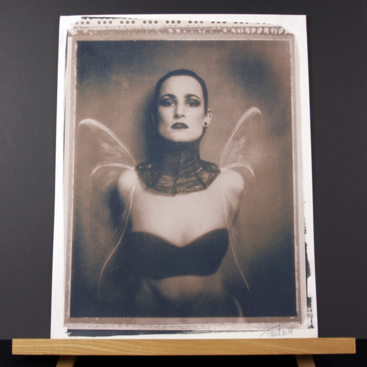
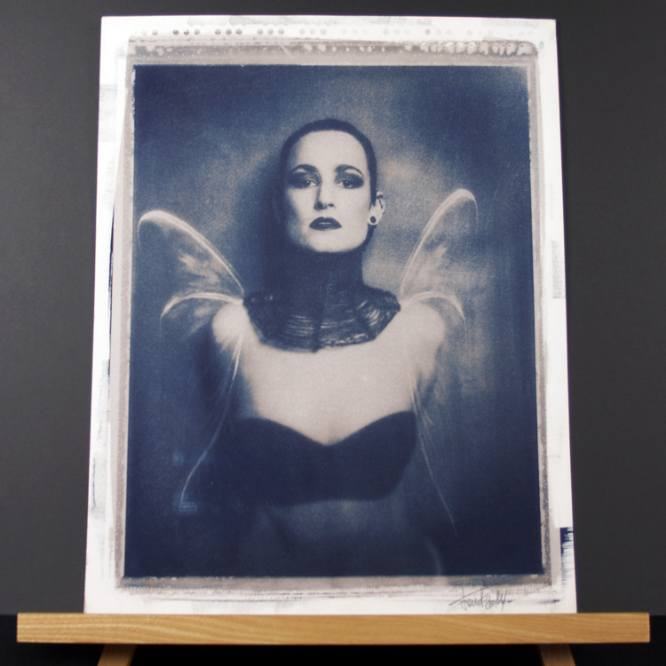
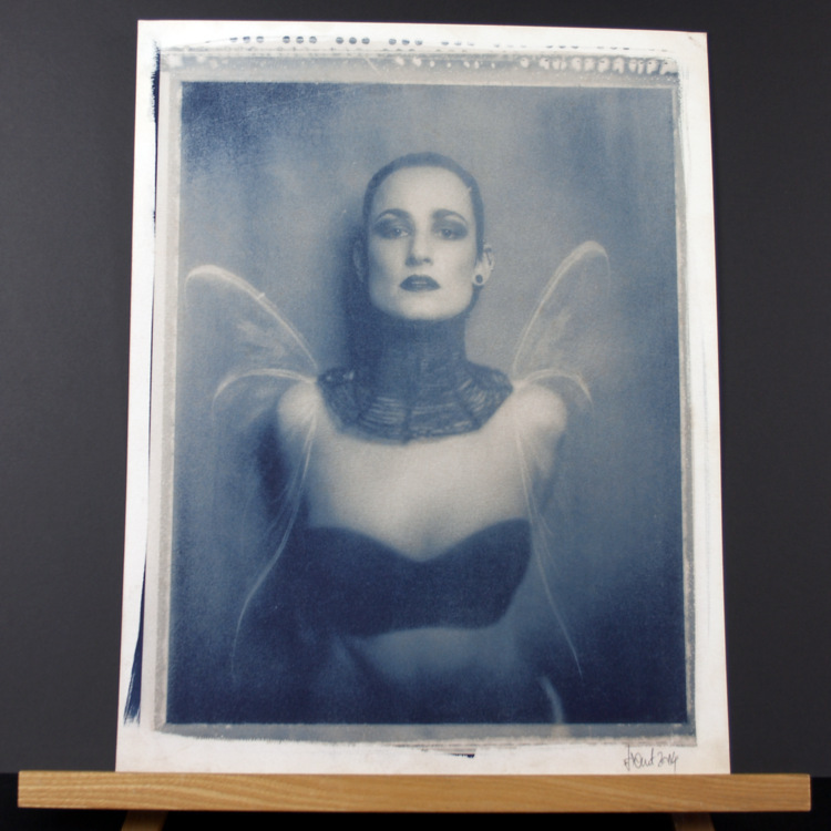
Three treatments, one image, one process, and three different outcomes. Every one of them started with an exposure choice made while thinking ahead. Under the negative the work began, but bleaching and toning carried it on.
The same negative in silver-based processes
Print four is a gold-toned kallitype. Print five is a Van Dyke.
Both still rely on that same negative, with exposure times set for the demands of each process. The portrait stays familiar, but its personality changes again.
In the kallitype, the image sits inside a wide white margin, with an uneven coating edge around it. That edge isn’t just a detail, it changes how I experience the photograph. The portrait feels held within the sheet, and the brushwork makes the handoff from image to paper obvious.
The Van Dyke returns to a more rectangular field. The wings, skin, and dark clothing settle into a different agreement in its warmer tone. It’s the same composition, but the relationships inside it have shifted again.
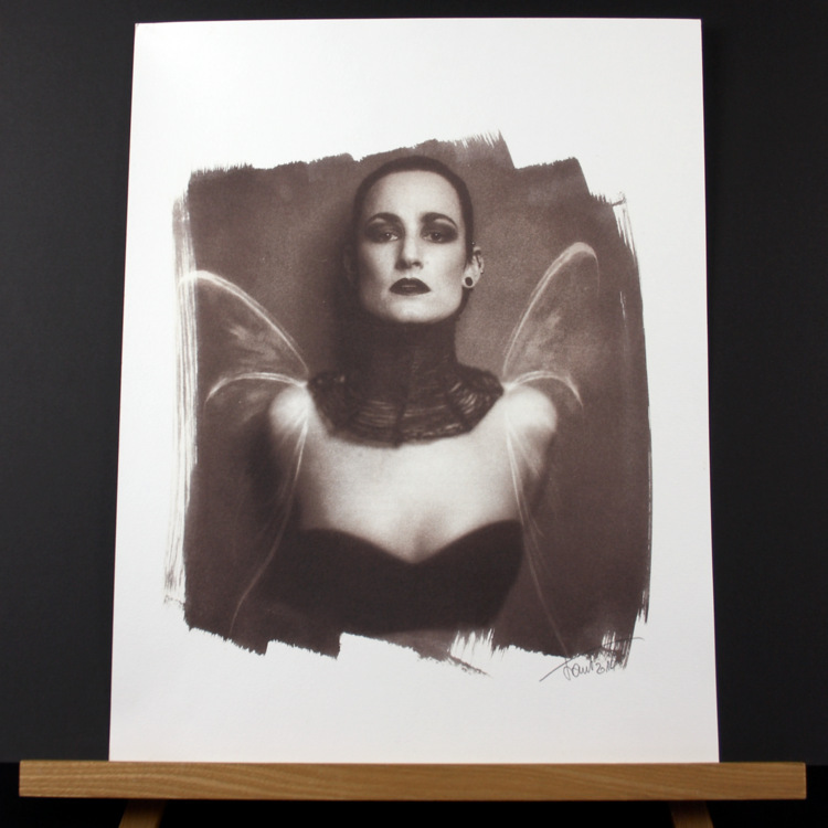
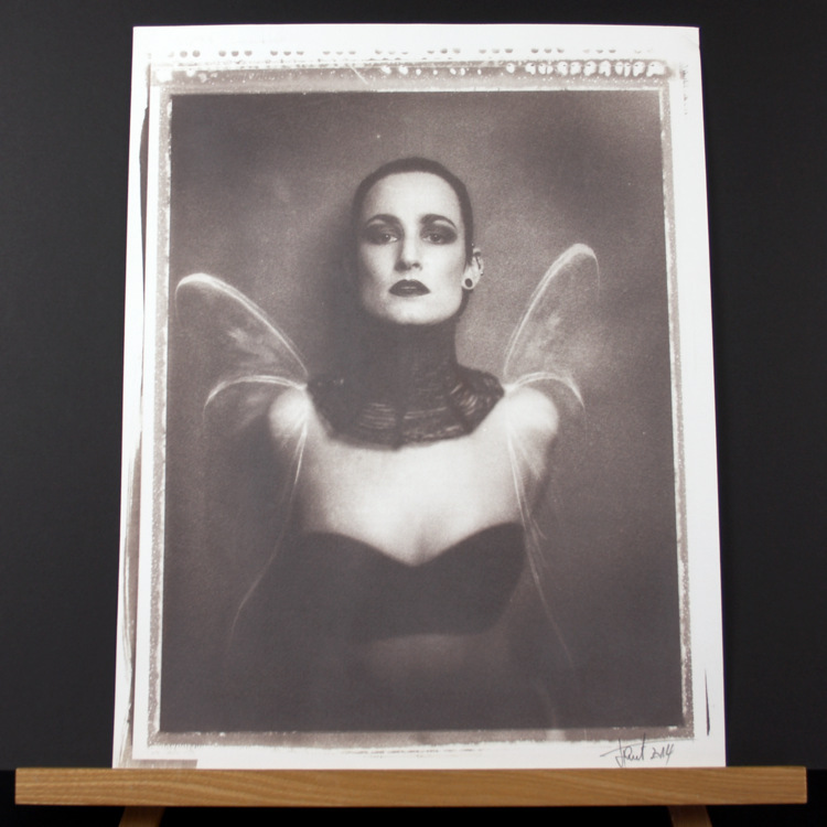
Seeing these beside the cyanotypes makes the spread easier to grasp. The negative carries the same information each time. Process choice, time under light, and whatever happens after exposure decide how that information turns into a visible photograph.
Looking at the whole sheet
In these photos I’ve left the borders, the coating marks, and the signatures in view. They’re shown on a wooden stand, with enough breathing room around them that you read them as sheets of paper, not just cropped images.
That context is part of the comparison. Each version has an edge, a size inside the sheet, and a relationship with the untouched paper around it. The kallitype, with its open brushwork and generous margin, is a different kind of meeting than the tighter, more rectangular prints.
A tight crop would make it easier to compare them as screen images, but it would also erase some of what makes these objects distinct.
And the photographs only ever carry so much. Light in the room, camera exposure, even the screen you’re looking at, all of it changes how they show up. The images let us see the group together, while still leaving the real surfaces and colours as something you have to encounter in person.
Working towards a mood
This is the point where craft decisions and the picture itself finally sit in the same place for me.
More exposure, extra density before bleaching, a toner choice, each one leaves a mark on what stays visible and how the portrait holds together. I’m reading the face, the dark clothing, the wings, the background, and deciding how much separation I want, how loudly each area should speak.
The negative stays constant, which means I can come back to it, take a different route through printing, and carry forward what the last result taught me.
These five prints are a record of some of those routes. Three stay within cyanotype and move through different treatments. Two shift into kallitype and Van Dyke. Each needed its own exposure, and each ended in a different balance.
The photograph remains recognisable the whole way through. What changes is the way it meets me when I’m standing in front of the finished sheet.

