Archive for category: Process

D’épuiser ‌la ‌lumière ‌— Exhausting the Light

There wasn’t really “light” in the comfortable sense, not enough to rely on, anyway. Still, I could see a photograph hiding in there. I had my Hasselblad, and I had the Rollei R3. After that, it was down to whatever that bulb was willing to give, and whatever I could coax the film into holding onto.

The people who lived there just waited, quietly, until we were done. And Candace nailed it!

That kind of patience, that kind of permission, feels like something that only happens in Paris. 🙂

And yes, the title meant exactly what it said. We kept at it until there was nothing left to spend, light-wise. The funny thing is, the real work didn’t end when we walked out of that hallway, it dragged on, in the best and worst way, long after.

Candace and I had worked together many times. There was a familiarity between us that made room for trying things, waiting, and trusting each other when neither the light nor the film offered much certainty.

I could explain what I was looking for, but the photographs depended just as much on what she brought to them. Her presence, her gestures, the way she occupied that hallway—all of it shaped what ended up on the negatives.

I remember the grain and the difficulty of printing because those were the problems I had to solve afterwards. But before any of that, there was Candace. Without her, these photographs would not exist.

 Twenty minutes in Rodinal

I shot the R3 at EI 6400. There was no room to be generous, and I was asking the film for favors it didn’t owe me.

For development, I went with Rodinal, 1+25 at 20°C. I already knew what happens when you push that combo past ten minutes, you don’t just get grain, you get a whole landscape of it. Mojave, Sahara, call it whatever you like.

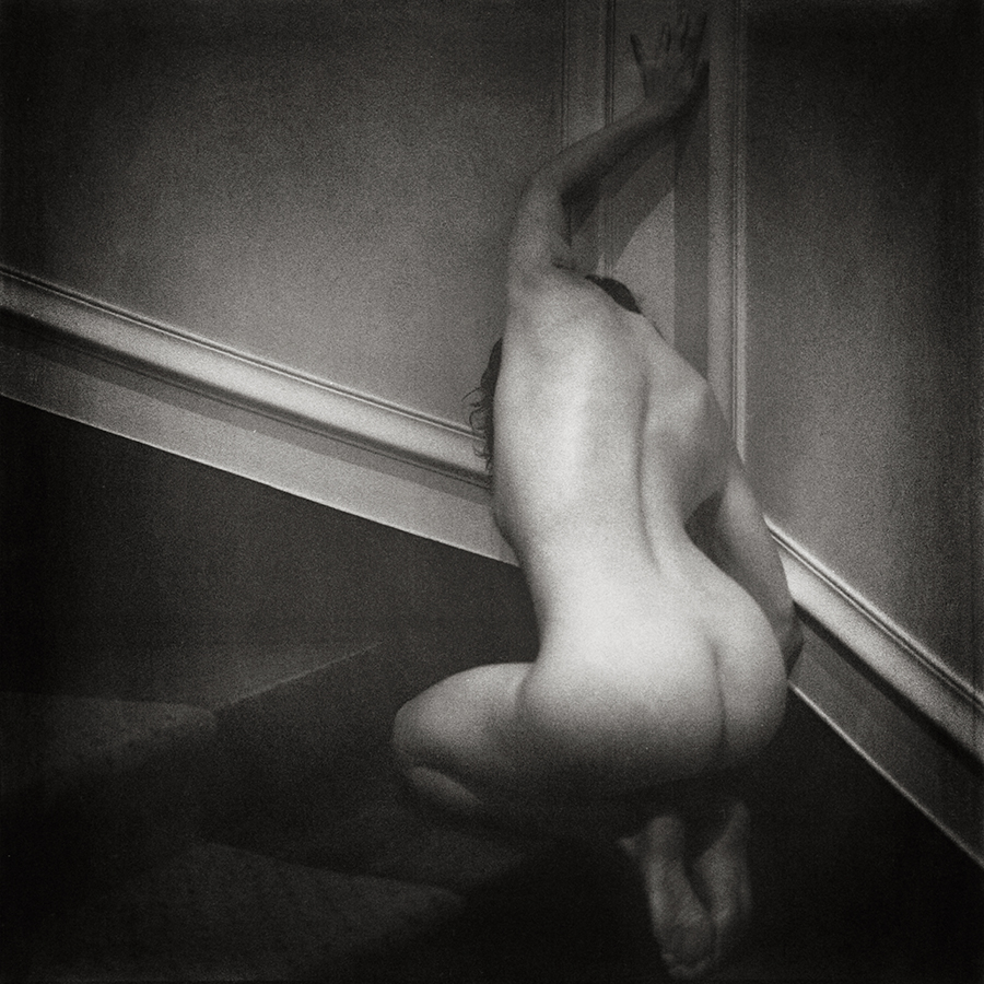
This time, that was exactly where I wanted to end up. I wanted the roughness. It matched what it felt like in that space, the heavy dark, the small slice of light catching skin, and the uncertainty in everything outside that little pocket of visibility.

Before I threw both rolls into it, I clipped a short test strip and gave it the full twenty minutes. I needed something physical to look at, not a guess.

And there it was. The atmosphere I’d been after.

So both rolls got twenty minutes each. I’ve never once wished I’d been more cautious.

The negatives came out with grain you could practically use as sandpaper. Getting that onto paper without losing the photograph, that was the next problem.
 The difficult part

When I think back on it, the printing, not the shooting, not the development, was the part that really tested me.

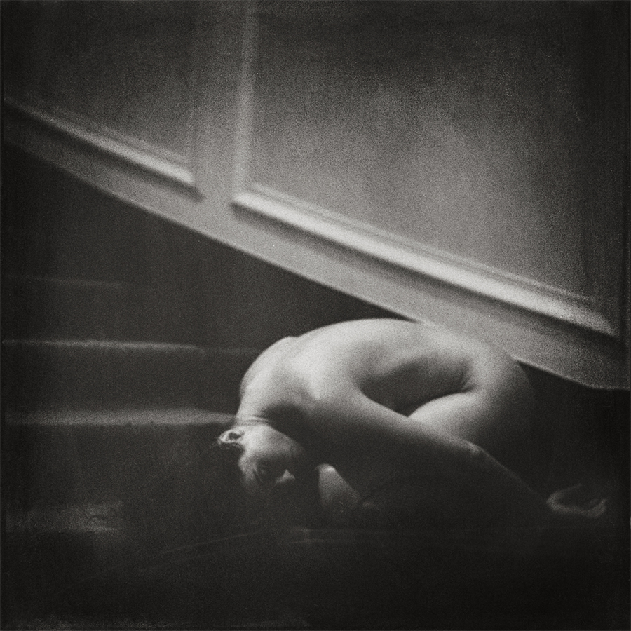
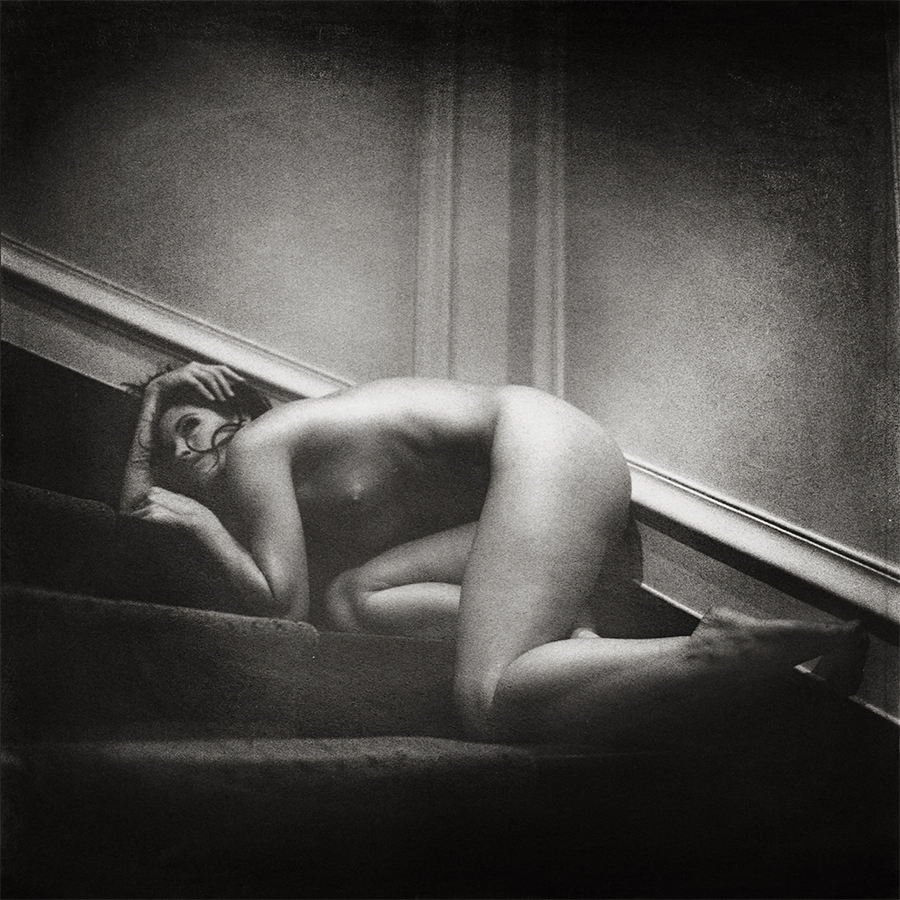
I wanted the grain, sure, but wanting it doesn’t make it cooperative. Too much, and suddenly the whole print is only about grain. I had to find the spot where the roughness held the mood up instead of stealing the stage.

That mattered more to me than a neat, technically polite print. I wasn’t chasing corner sharpness or tidy little proofs of precision. What I wanted was to recognize the reason I’d made the photograph at all.

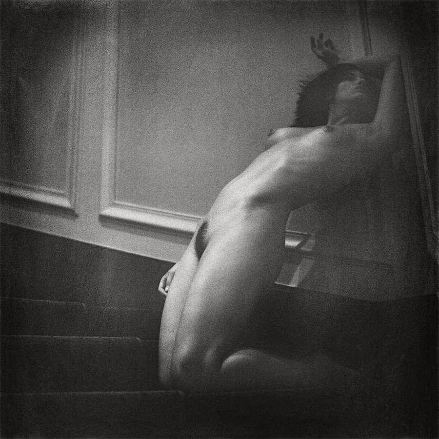
The staircase frame carries a lot of that for me. There’s a line of light along the back, light across the legs, a face close to the steps, a hand lifted above the head. The moulding cuts diagonally through the space. Then, beyond the obvious, the stairs and the body fade into places that make you slow down and look again.

I like that. Those darker parts give your mind somewhere to wander.

If I’d forced open every shadow, it would’ve become a different picture. I needed enough visibility for the gesture and the space to stay believable, but I didn’t need the hallway explained like a diagram. Some things were allowed to stay unfinished.

So printing turned into a hunt for relationships: how much exposure the figure needed, how loud the grain could be, and where the darkness should be allowed to keep its hold.
Finding the balance

Having the right gear made this a lot less punishing.

I printed on Poly Warmtone paper using a Durst Laborator 1200 with a multigrade head, plus the Heiland Splitgrade controller. The Splitgrade helped me pin down exposure and contrast and gave me a sensible starting point, which matters when the negatives are this stubborn.

It also made the local work easier, dodging here, holding back there, and keeping the balance across the print under control.

Even with measurements, the choices didn’t disappear. Numbers can tell you where you are, but they don’t tell you if the print actually carries the mood. I needed the grain to stay present without flattening the face, the gesture, or that thin bit of light that described the space.

That’s where the energy went. I’d already made the call with exposure and development. Now, at the enlarger, I had to make that call land on paper.

No pain, no gain, I guess. Though those negatives made a pretty good case for the pain side of the deal. 🙂
 

Out of the darkroom

Once the prints were finished, they were scanned and reproduced at 120 × 120 cm for exhibitions.
Those big reproductions came straight from the prints, so everything I’d wrestled into place at the enlarger traveled with them, the tonal balance, the local adjustments, the choice to let certain areas stay dark. The grain came along, too.

Seeing the work at that scale, I felt satisfied, and honestly, a bit relieved. The images held up the way I’d hoped. They looked at home in an exhibition setting, and they looked like they could live in someone’s house without me feeling like I’d sent something unfinished out into the world.

When I return to them now, I’m right back in that hallway, remembering how little light there was. I also remember what it took to print them. Choosing grain in development was the easy part. Living with it under the enlarger was the harder one.

But it gave me the feeling I’d been chasing.

And the shadows, in the end, kept a little piece for themselves.


Photographs: Vernon Trent
Model and Muse Collaborator: Candace
Domburg: ‌One ‌Negative, ‌Several Lives

An invitation from a friend took me to Domburg in the winter of 2015. Weather and sea were dramatic. We left our bags and our watches behind, and let the place take its own time with us.

I saw something I wanted to capture. No setup, no elaborate hunt for a composition. Just one of those things where the scene finds you and you know it needs to be photographed.

I had my Holga WPC with me.

The other Holgas have a cult status for a good reason. I get it. I love pinhole photography. The 6 x 12 cm format of the WPC gives you space to work with. Just the right amount of room for a wide beach, wild sea and dramatic sky.

No rangefinder. You compose, frame and, using a pinhole camera, calculate the exposure with a pinhole calculator. Some things are easy to calculate, some aren’t. But both is part of what keeps me interested in the process.

The scene only really announced itself to me when I developed the film. There it was among the frames. I saw its potential immediately and wanted to explore what different ways of printing it might bring out.

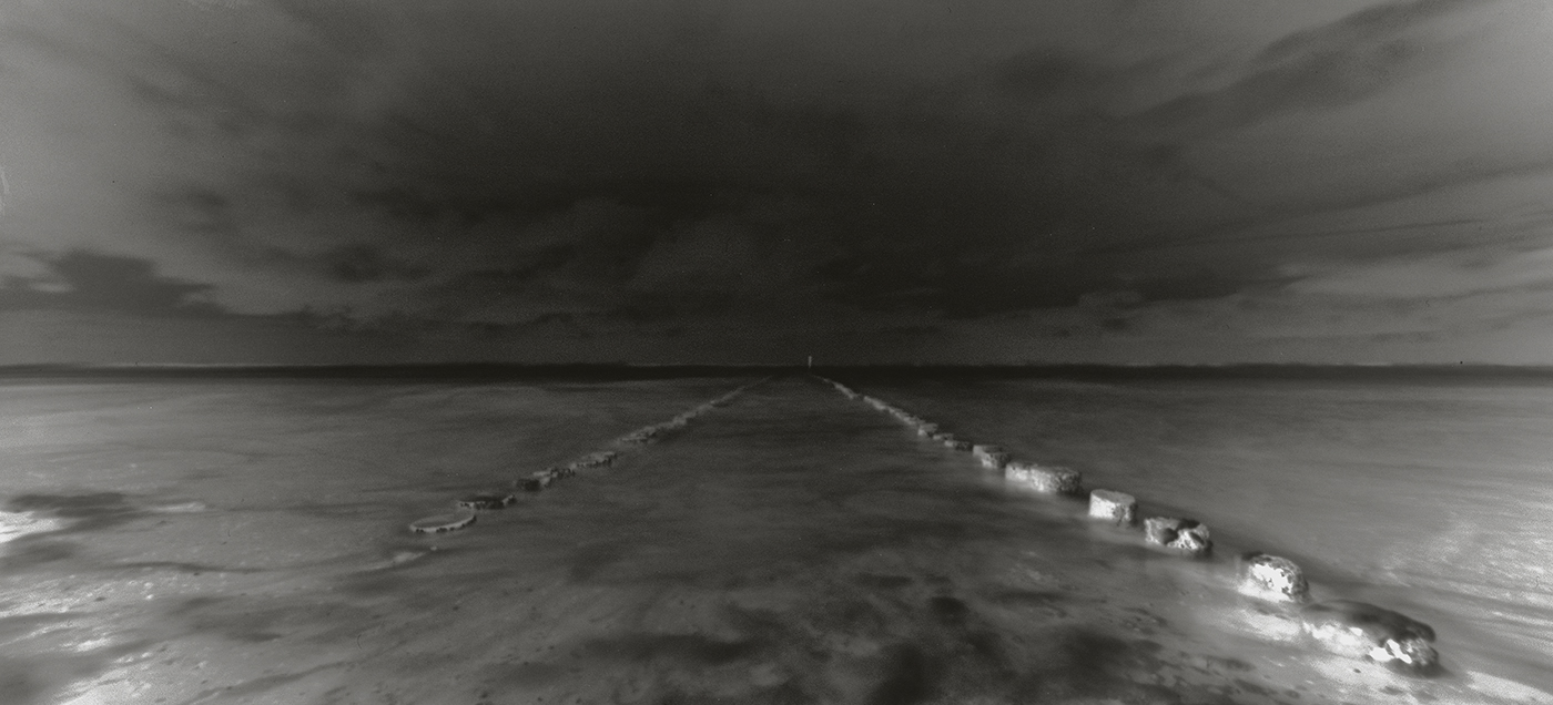
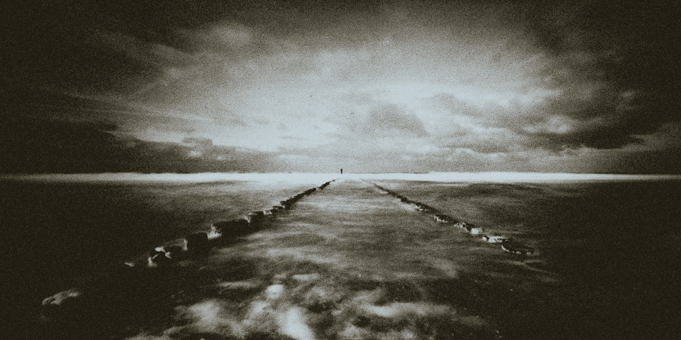
Negative scan Domburg, winter 2015. Original 6 × 12 cm film negative, made with a Holga WPC pinhole camera. Shown in negative tones.

It became a conventional black-and-white print, a lith print and a cyanotype.

Each one gave me another opportunity to spend time with the image. The ‌lith ‌print ‌took it more towards dark. To me it just seemed like on the road to hell. That print was sold and I didn’t keep a digital backup.

For me, the cyanotype felt more at home with the subject matter. The deep blues seemed to fit the scene. I made a digital negative of the original 6 x 12 cm film image in order to transfer the photograph into another printing process.

Same starting point, another way of being present with the photograph.

The black-and-white print and the blue print offered me different ways of looking at the weather, sea and space in between. Neither was necessary without the other. They offered different weights to the things that were already there.

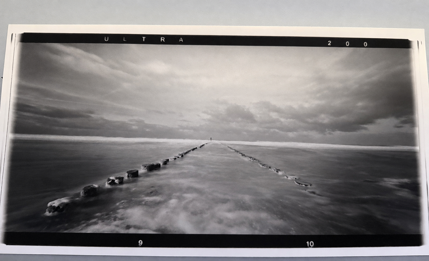
Baryta print Domburg. Black-and-white darkroom print on glossy baryta paper, from the original 6 × 12 cm negative.

Much of what draws me to this photograph has to do with the tension within the image.

The sky can be overwhelming. So can the sea at the bottom of the image. There’s power in both that makes you aware of how small you are in relation to the sea. But as my focus moves towards the centre of the image, the photograph takes on a more lonely feeling.

I keep moving between unease and solitude, and back to unease.

Not every photograph benefits from showing you all the detail. Some images gain enormously from fine detail. With this one, I’m more interested in the mood. My pinhole photograph gives me enough information to identify the place and the weather, and leave the rest to me as I look at it. I don’t need to see all the small things resolved.

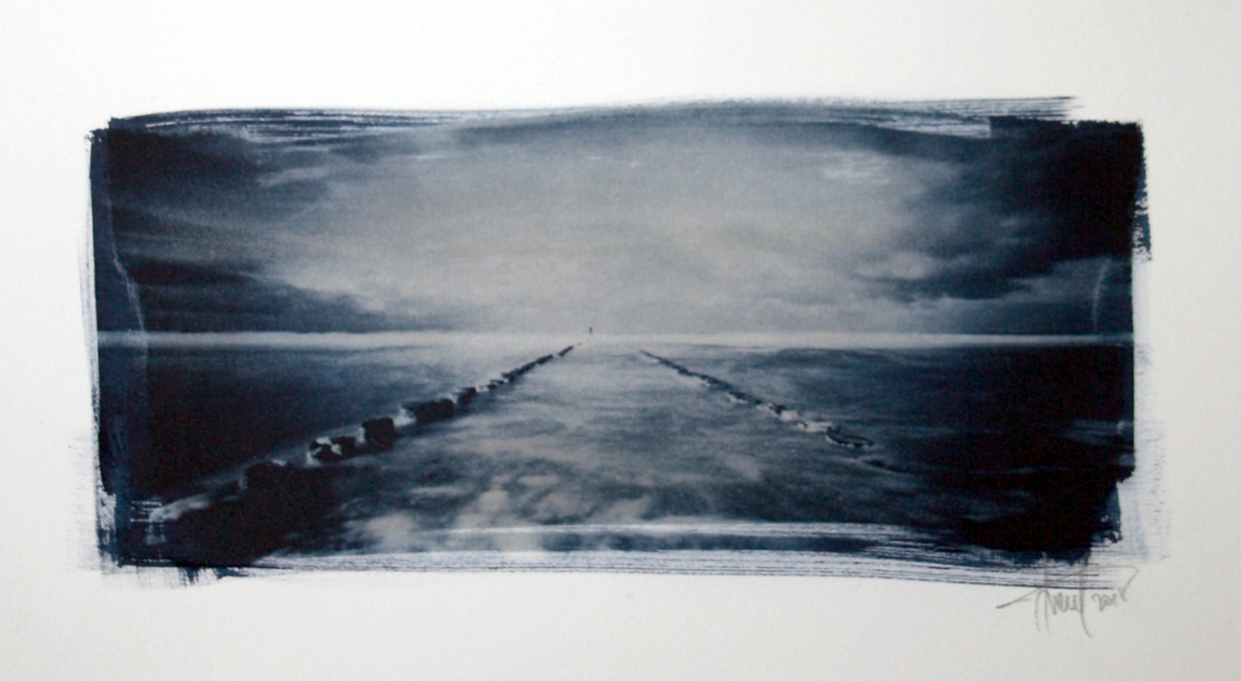
Cyanotype Domburg. Hand-coated cyanotype, made using a digital negative derived from the original film image.

Which is another reason I was interested in printing it. I wanted to see how the mood would hold – and where it would change. The different printing processes became different ways for me to ask that question with my hands.

This is the kind of encounter I want to make space for in REVELARTEURS: a photograph worth looking at, the decisions behind it and what you can learn by following them a little ways further.

Domburg started with a walk on a winter beach. The negative gave me something to come back to. The prints kept the dialogue going.

Photographs and prints © Vernon Trent.

Coffee ‌klatch, ‌twelve seconds, and a bit of making-it-up-as-we-go

Back then I was only just getting my feet under me with wetplate collodion, still trying to get a feel for the whole strange rhythm of it. Coating plates, keeping them clean, reading the light, then somehow surviving the wet part without turning everything into a sticky disaster.

The studio didn’t really know what I was about to ask of it, and if I’m honest, neither did I. I’d hauled this process into the room before I’d fully grasped what the room needed to give back. So the day turned into pure improvisation.

A temporary darkroom

We ended up drafting the studio restroom into service. That became the wet-work zone where I poured, sensitized, and developed, while the camera sat out in the main space with the natural light.

Wetplate forces you to move fast and move carefully. You’re going back and forth, chemistry in play, a plate in your hands, and a picture to make before the clock runs out and everything dries on you.

And the light, of course, wouldn’t sit still for me. Daylight kept shifting, and I kept guessing, then guessing again. At that point I didn’t have much experience to lean on, every plate was another lesson delivered the hard way.

The studio also wasn’t exactly built for chemical Armageddon, so along with everything else I was trying to keep the mess contained.

The next day I noticed thin black flecks on the floor, like a breadcrumb trail from restroom to camera. Silver nitrate. Turns out I’d documented my walking route, too.

Something to do with twelve seconds

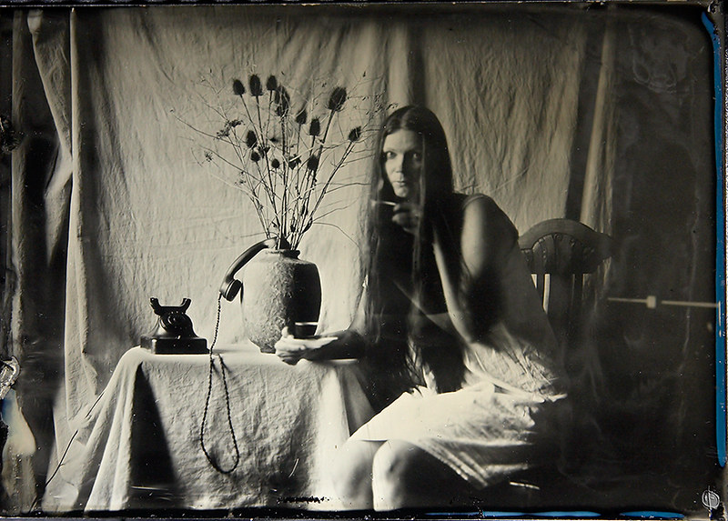
“Coffee klatch” was made on a 5×7 aluminium plate, with a Russian FDK camera and an Industar 210 mm f/4.5 lens.

For this one I landed on a twelve-second exposure.

Once the set was arranged and Mrs. Hyde was settled, a thought hit me. Twelve seconds is long enough for something to happen inside the frame, if we were brave enough to try it. I asked her to move the hand holding the cup when I gave her a cue.

So we staged it inside the exposure. For about the first half she held steady. Then, on my signal, she shifted slowly, taking around three seconds to reach the new position, and she stayed there for the last few seconds.

It was a gamble. My hope was that the still moments would register as two readable positions, and I honestly had no clear idea what the in-between motion would do.

She had to do a lot: hold the pose, listen, move gently, settle again, all while time kept running. Her timing mattered just as much as mine.

We did a single take.

More than I expected

When the plate came up in development, the surprise wasn’t the pose, it was the motion.

I’d been thinking in terms of those two held positions, but even that slow transition showed itself. With the low sensitivity I was working with, roughly ISO 1–2 territory, I wasn’t sure the brief movement would leave much behind.

But it did. More than I expected.

If you look at the hand and cup, you can actually trace a small event unfolding in the middle of an otherwise locked-down still life. The telephone, the vase, the dried stems, the draped cloth, they stay put. And next to them, the cup has clearly gone somewhere.

I’d called the action, sure. Still, seeing what the plate decided to keep was a different thing entirely. At that stage I was learning, in real time, what the process would do with my choices.

This time it handed me something I wanted to hold onto.

One try was enough. I was also getting low on materials, and aluminium sheets weren’t cheap. There wasn’t some bottomless stack waiting for “take two” and “take three.” I had a plate that startled me in a good way, and I left it there.

Operator not available

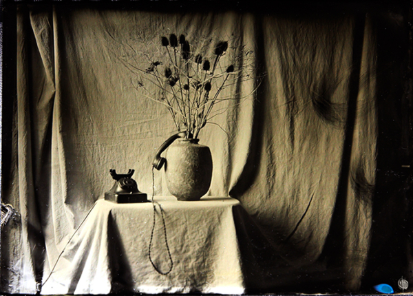
Later on I photographed the setup again, only without Mrs. Hyde.

The table, the telephone, the vase, all still there. Yet without her, that empty space beside them suddenly became the loudest part of the picture. The receiver stayed off the hook, the cord dropping over the cloth.

That image is up on XoverIP as “… operator not available.”

Maybe the coffee was stronger than it looked. 🙂

Looking at the pair now, what comes back is how much of that day we were solving on the fly, the wandering light, the exposure guesses, the restroom darkroom, the awkward dance of unfamiliar chemistry in a room meant for something else.

And I keep thinking about that moment where I asked her to move the cup, without really knowing what we’d end up with.

Twelve seconds, one slow gesture, and a plate that still carries the surprise.

—

*Making notes: “Coffee klatch,” featuring Mrs. Hyde. Wetplate collodion on a 5×7 aluminium substrate; Russian FDK camera; Industar 210 mm f/4.5 lens; twelve-second exposure. Hand movement deliberately cued during the exposure.*

Same ‌negative, ‌different chemistry

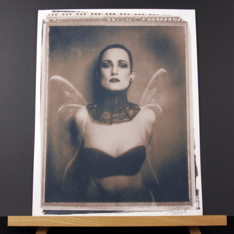
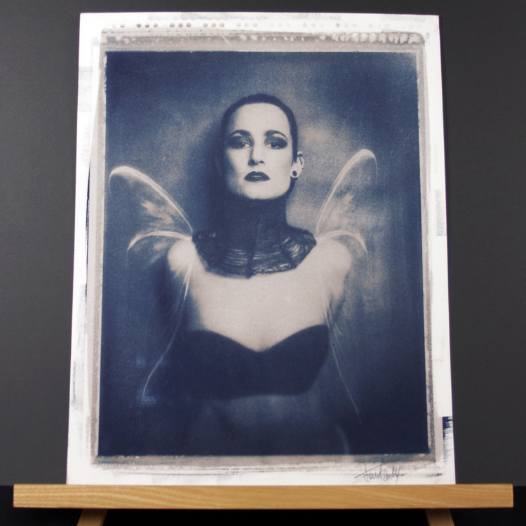
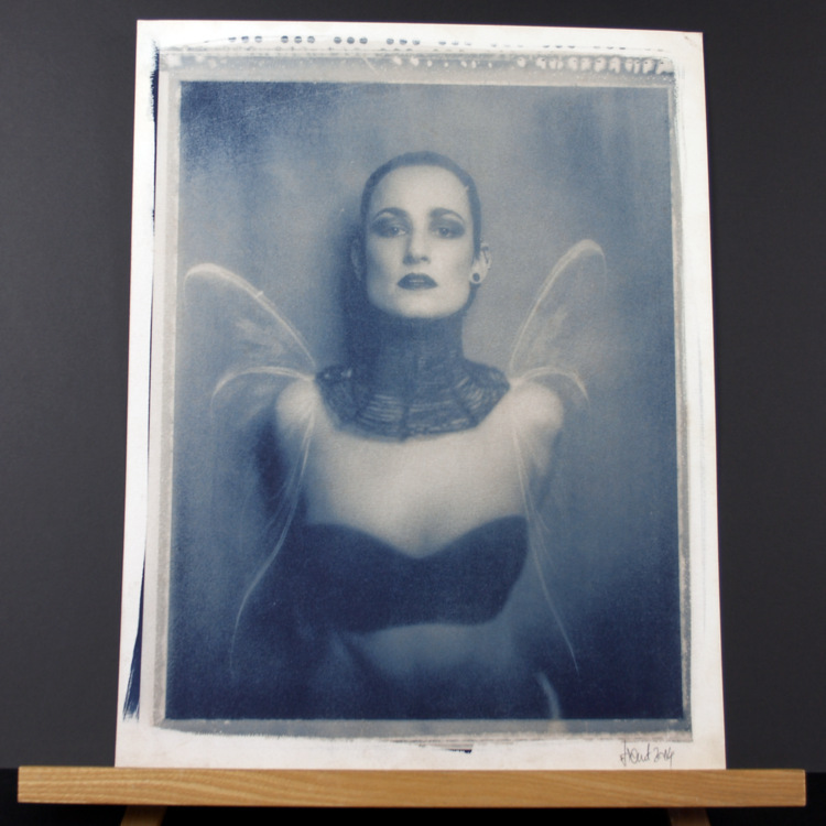
Laying these five prints side by side, I don’t hesitate, it’s clearly the same photograph. The pose, that direct look, the soft, pale wings sitting at the shoulders, it all starts from the same place. But my focus doesn’t land in the same way every time. Each print pulls me to a different spot.

They all came off the very same physical negative. What shifted at the printing stage was time. Cyanotype asked for more of it than kallitype or Van Dyke, and even among the cyanotypes I changed the exposure depending on what I knew I would do later.

Because “later” isn’t an afterthought here, it’s baked in from the start. If a print was headed for bleaching and toning, it needed extra density upfront so it could take the hit and still leave me something to shape. I was printing for an outcome I wouldn’t actually see until further down the line.

Allowing for what comes next

Printing an image that’s going to change again before it’s finished asks for a specific kind of judgement. You’re staring at one stage, but your mind has to stay with the next one.

With these cyanotypes, that meant giving certain sheets a deliberate push in exposure. Bleaching would strip away part of the image. So I needed that added depth waiting in the print, enough to survive the loss while still keeping what would eventually give the portrait its weight.

Start too thin, and you end too thin. The exposure had to carry the entire run, printing, bleaching, toning, and then the final balance between her figure and the space she sits inside.

What I was aiming for was the feeling of the finished print. Exposure time was one of the tools that got me there.

Three ways through cyanotype

The first three prints are all cyanotypes. That matters, because even before I bring another process into the mix, the differences are already big.

In the first version, I bleached with soda and then toned with tannin. In the photograph of that print, the warmer areas settle up against cooler, darker passages. The face pushes forward, and the wings feel suspended, not quite background, not quite fully with the figure either.

The second went into coffee. A lot of blue still stays in the image. A label like “coffee toned” tells you what was in the tray, sure, but the print still has to be read on its own terms. Here the deeper blue tightens the portrait, especially around the head and the clothing.

The third was toned with concentrated green tea. Compared with the others, it lands lighter. Figure and background sit closer together tonally, and the wings arrive more quietly. My eye travels through it in a different rhythm, lingering longer in the pale space around the shoulders.

Three treatments, one image, one process, and three different outcomes. Every one of them started with an exposure choice made while thinking ahead. Under the negative the work began, but bleaching and toning carried it on.

The same negative in silver-based processes

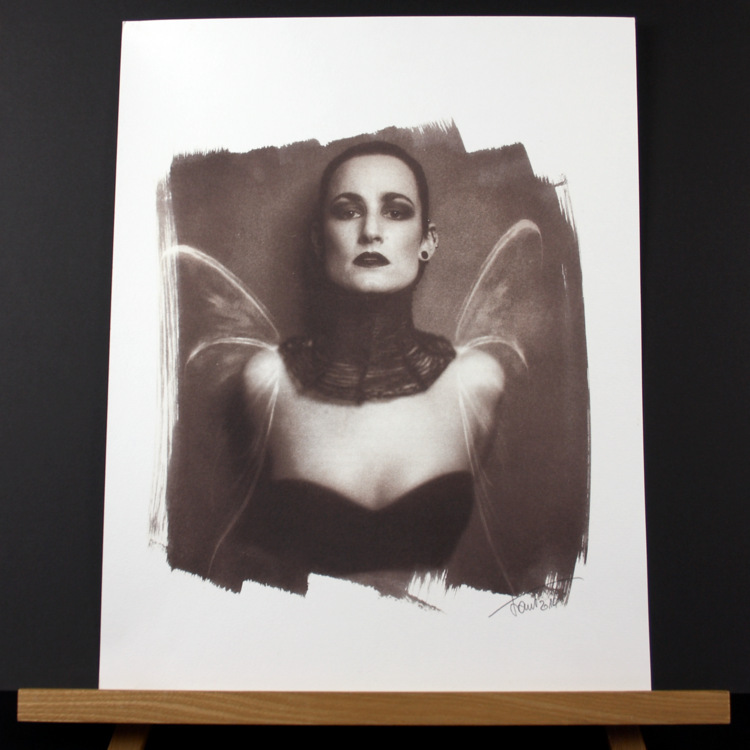
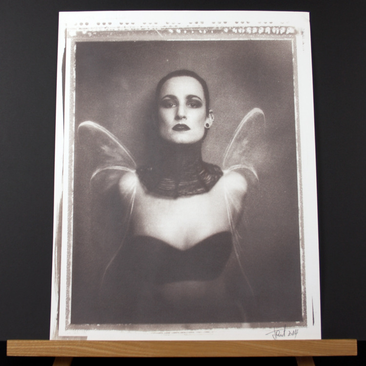
Print four is a gold-toned kallitype. Print five is a Van Dyke.

Both still rely on that same negative, with exposure times set for the demands of each process. The portrait stays familiar, but its personality changes again.

In the kallitype, the image sits inside a wide white margin, with an uneven coating edge around it. That edge isn’t just a detail, it changes how I experience the photograph. The portrait feels held within the sheet, and the brushwork makes the handoff from image to paper obvious.

The Van Dyke returns to a more rectangular field. The wings, skin, and dark clothing settle into a different agreement in its warmer tone. It’s the same composition, but the relationships inside it have shifted again.

Seeing these beside the cyanotypes makes the spread easier to grasp. The negative carries the same information each time. Process choice, time under light, and whatever happens after exposure decide how that information turns into a visible photograph.

Looking at the whole sheet

In these photos I’ve left the borders, the coating marks, and the signatures in view. They’re shown on a wooden stand, with enough breathing room around them that you read them as sheets of paper, not just cropped images.

That context is part of the comparison. Each version has an edge, a size inside the sheet, and a relationship with the untouched paper around it. The kallitype, with its open brushwork and generous margin, is a different kind of meeting than the tighter, more rectangular prints.

A tight crop would make it easier to compare them as screen images, but it would also erase some of what makes these objects distinct.

And the photographs only ever carry so much. Light in the room, camera exposure, even the screen you’re looking at, all of it changes how they show up. The images let us see the group together, while still leaving the real surfaces and colours as something you have to encounter in person.

Working towards a mood

This is the point where craft decisions and the picture itself finally sit in the same place for me.

More exposure, extra density before bleaching, a toner choice, each one leaves a mark on what stays visible and how the portrait holds together. I’m reading the face, the dark clothing, the wings, the background, and deciding how much separation I want, how loudly each area should speak.

The negative stays constant, which means I can come back to it, take a different route through printing, and carry forward what the last result taught me.

These five prints are a record of some of those routes. Three stay within cyanotype and move through different treatments. Two shift into kallitype and Van Dyke. Each needed its own exposure, and each ended in a different balance.

The photograph remains recognisable the whole way through. What changes is the way it meets me when I’m standing in front of the finished sheet.